Architecture and Running by Ignacio Alonso

As we celebrate Haruki’s Murakami ‘Princesa de Asturias’ literature award, it brought back the memory of the Murakami’s book ‘What I talk about when I talk about running’, a precious reading for those that enjoy reading, and also running.

As a runner, I will always remember the passage when Murakami is finally running a marathon, and his description of the mental fight at the very end of the race to avoid walking and keep running to the finish line. We (marathon runners) know how hard these final meters are (and sometime kilometers, depending on your resilience).

I also admire how Murakami describes running activity as a way of inspiration and meditation for his ongoing writings. In this regard, I recognize myself when training around the city, and observing the surrounding architecture as a way of contemplation, admiration, and sometimes inspiration for my own ongoing architectural projects. 

Can’t think of a better place to do this than New York City. During my several years of training around the city (9,217 Km around the 5 boroughs, and counting) I ended up planning my routes around the architectural marvels that the city offers.  Contemplating the landscape, some of its staggering civil engineering structures, and mostly the buildings, provided an incredible source of inspiration, beside making those miles to seem shorter.

Here I propose three of my favorite routes around Manhattan in connection to the architectural landmarks to be found. For the avid runners these runs can be performed on a single run, but otherwise can be split into segments and do the return trip by using the subway (carrying a MetroCard is always a helpful tip, in case weather deteriorates or your legs are giving up).

Run #1 - Roosvelt Island or ‘the fathers of modern architecture.’

Run #1 – the fathers of modern architecture

This run map also includes the Central Park (see run #3 below), but for now I’ll focus in the passage from Manhattan to Roosevelt Island. In order to cross the East River from Manhattan, go to the north side of the Queensborough bridge at 56th St between 1st and 2nd avenue. There’s a cycling and walking path that crosses the bridge.  This is a great run for training up and down hills, as the bridge provides one of the longest gradient elevations to find running around Manhattan (there’s an almost 5% gradient slope, a 20m height climb).

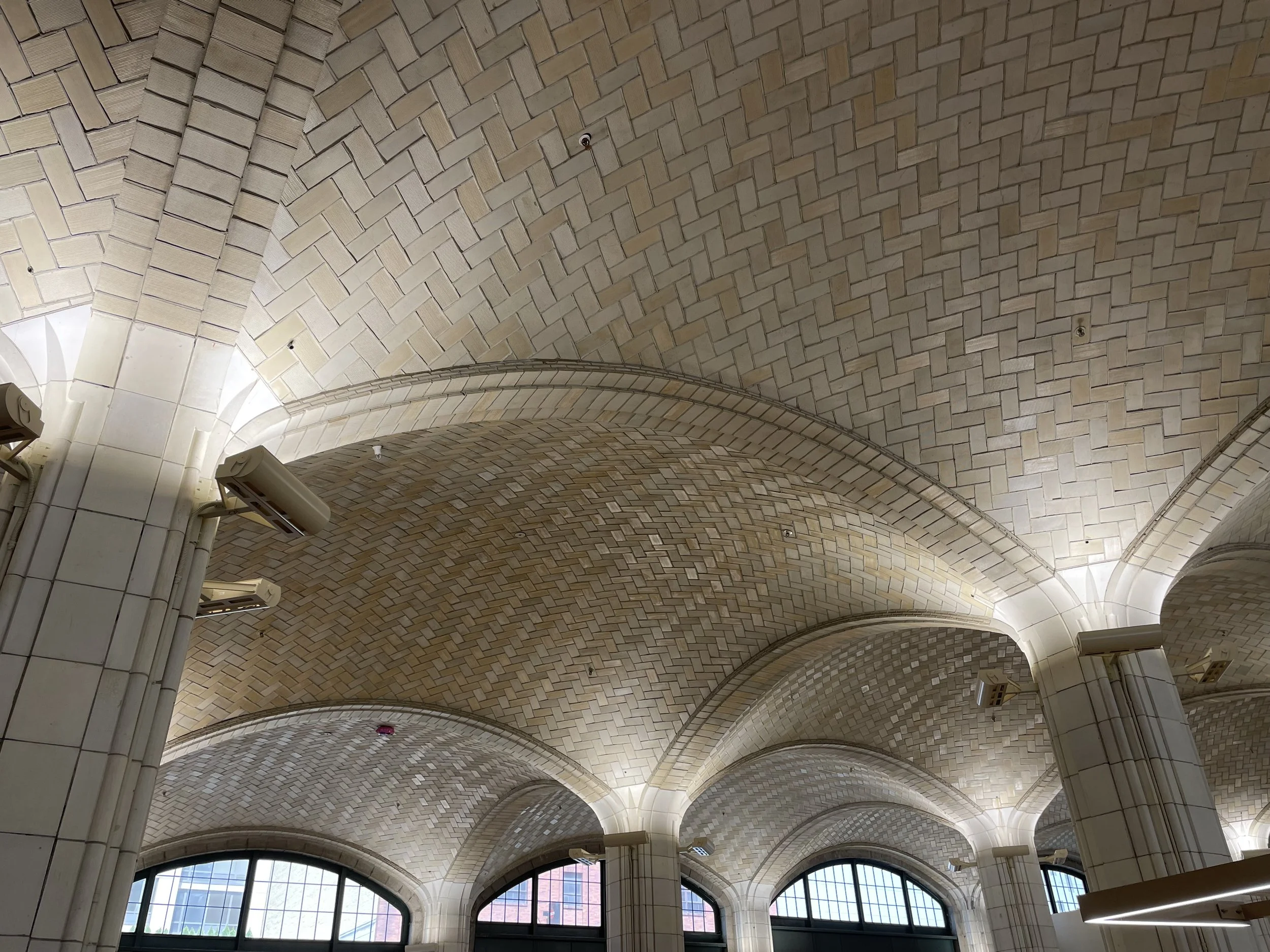
Gustavino’s vault under Queensboro Bridge

Right before getting into the path, there’s one of the Gustavino’s tile vault works (now a Trader Joe’s supermarket under the bridge). These are the same popular tile vaults you might find in Grand Central. Take a quick peek inside the market.  Rafael Gustavino was a Spanish architect that moved to NYC in 1881. His patented version of the ‘catalan vault’ (a historical brick arch with its origin in the roman times) made him famous. His design provided a sleek way to resolve big spans between columns.

Queensborough bridge pedestrian and biking path

The Queensboro bridge was erected between 1901 and 1909 with a collaboration of the same architects that designed Williamsburg bridge, Leffert L. Buck and Henry Hornbostel, both led by Gustav Lindenthal. The bridge represents the constitution of Greater New York City and the amalgamation of the 5 boroughs. The original bridge considered the upper deck as pedestrian, with an adjacent construction to connect with Roosevelt Island, which was demolished in the 50s.

Once at the other side of the river, follow the riverside up north, to the Welfare Island bridge, which provides pedestrian crossing to Roosevelt Island.

Roosevelt Island provides a great continuous running loop around its borders, with magnificent views over Manhattan.

Sert’s Roosvelt Island housing project original as built plans.

At the island, heading south from the bridge along the east side, is one of the largest projects ever designed by Spanish Architect Josep Lluis Sert. Sert emigrated to the United States due to the Spanish civil war. Close friend of Le Corbusier, he’s considered one of the fathers of modern architecture. The building clearly reflects that. Some of its sections are cantilevered over the streets, exposing the ‘pilotis’ system. The general massing escalates its high from the river (lower) to the town center (higher). Building’s stairwells are external, providing clear floorplates without internal vertical obstructions. The units inside maximize volume rather than square footage, so the apartments are ‘duplex’ or even ‘triplex’: because of this, the distribution corridors are only located every two or three floors, making possible locating them facing the exterior and getting lots of light. In 2019 as part of the 50th anniversary of the building I had the opportunity to visit, and despite the general deterioration of the building due to its age, the quality of the interior common spaces remains intact: hallways filled with light and views, and spacious entrance lobbies with double height ceilings.         

Run #2 West Highway or the Pritzker Prize HIghway

Run #2 – the Pritzker Prize Highway

The West Side Highway provides what must be one of the longest uninterrupted runs in an urban environment. Starting at the South Ferry terminal it runs continuous without any street crossing way beyond George Washington Bridge. It crosses several Parks, and having clearly differentiated the path between cycles and runners, it is very safe to run on. The stretch to focus here is between 21st street and Clarkson Street where in the length of around 20 blocks it can be found the work of up to 7 Pritzker winners, making the stretch very unique and rich, architecturally speaking.

Norman Foster

Coming from the North, the first building to be found is a condominium building at the corner of 21th St by Norman Foster. I do remember following its construction, and it has a beautiful structural detail at the corners, where there is no column, allowing a continuous corner window without obstruction. 

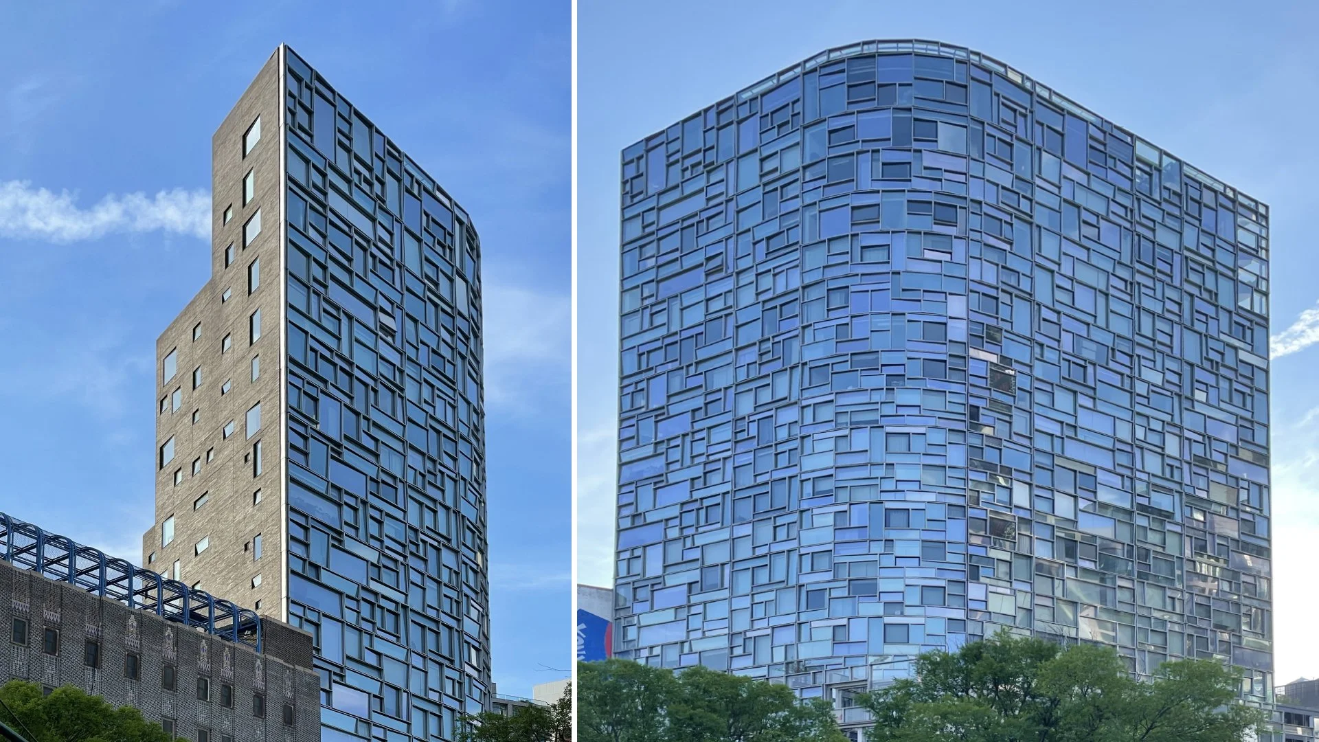
Jean Nouvel

Frank Gehry

Shigeru Ban

Renzo Piano

Further down at 19th St is another condominium building, this time by Jean Nouvel. It’s in the south facing corner, and the building features an exterior cladding with randomized glazing, in contrast with the north black brick wall, almost solid. Right in front of it is the IAC building by Frank Gehry, a building that resembles a set of sails. Each glass panel features a unique shape and size. The gradient pattern of the glazing provides a beautifully integrated sun control device into the building. Right next to it at 19th St there’s a low-rise condominium building by Shigeru Ban. Its minimal style makes it blend into the neighboring buildings, making it hard to spot. Named as ‘metal shutters’ the duplex apartments have an exterior motorized screen to provide intimacy inside. Further south between 12th St and Gansevoort St is the Whitney Museum by Renzo Piano, one of the latest additions to the area. Defined by Piano as a docked boat echoing the history of the area, one of the upper levels features an oversized picture frame window facing the river.

Richard Meier

Between Perry and Charles St is a set of 3 condominium buildings by Richard Meier. They feature a glass cladding with some of his signature white paneling. The flat curtain wall at two of the buildings provide a beautiful reflection merging the river at the opposite side with the blue skies. Between Leroy and Clarkson is another condominium building, this time by Herzog & de Meuron. It is an exposed concrete structure in a semi-rounded shape with windows from floor to ceiling. The thin concrete slabs matching the thickness of the columns, creates a harmonious structural grid, vertically and horizontally.  

Run #3 Central Park

Central Park is the ‘patio’ of New York City. I have been there running, racing, walking, biking, skating, laying in the sun, watching theatre and movies, reading a book, listening a rock concert and a symphony orchestra.  My very first run in New York was in Central Park. At that time, cars were still running inside in some of the sections. The original narrow running lane was shared with bikers, and you had to be constantly vigilant to avoid crashes.  These days, cars are banned, so the entire old traffic lanes are now for runners and bikers; and without any street light crossing, is a 10Km non-stop continuous loop. One day I had the opportunity to have breakfast with Peter Ciaccia (NYC Marathon Race Director) and I told him the only thing Central Park needed to become the biggest Olympic Stadium and Track of the world, was to pour a tartan floor on the running lane: he loved the idea.

With Peter Ciaccia (center) the night before NYC Marathon

I do also like the ‘flexible’ runs the Park provides. You can opt for a very short loop, for example just around the Reservoir, on gravel; or extend the run a little bit using the traverse at 102nd St on tarmac; or go for full round and tackle Harlem Hill, the steepest climb in the park, and the rest of the hills along the West Side.

There’s a huge variety of architectural surroundings, from pre-war buildings on the west side, to the east side townhouses. But the portion that had a more profound change in the recent years is the south side skyline along 59th St, what is now referred as billionaire’s row. In the last 10 years there’s been an implosion of high-rise condominium towers.

Super tall residential buildings along Central Park South

Next to Columbus Circle is one of the latest additions, the Central Park Towers, a square glazed tower by Adrian Smith + Gordon Gill architects, same designers behind world’s tallest building, Burj Khalifa. This building is currently considered the second tallest building in NYC, and the tallest residential building in the world.   Between 7th avenue and 6th avenue is the One 57 tower by Christian Portzamparc, the building that re-started the race for residential supertall in the area in 2010.

Just behind it and topped using a copper faced dome is the City Spire building, a Helmut Jahn design which was the second tallest concrete building in US when completed in 1989 (after Sears Tower).

The Steinway Tower by SHoP Architects during construction.

Adjacent to One 57 is the Steinway Tower by Shop Architects. The building features a ‘sword’ shape as a result of the required setbacks for sky-exposure plane. Finished in terracotta, as an homage to a historical cladding material used in Manhattan, is the third tallest building in the city. 

The MoMA Tower by Jean Nouvel during construction.

Behind it is the MoMA Tower by Jean Nouvel, another building topped with a sharp edge. Looking east is the 432 Park Avenue building by Rafael Viñoly, which features a square grid pattern façade, is the fifth tallest building in the city, and used to be the tallest residential building.

All pictures by Ignacio Alonso, taken during his runs.

Ignacio Alonso at the Reservoir

Campus Iberdrola by Ignacio Alonso

by Ignacio Alonso

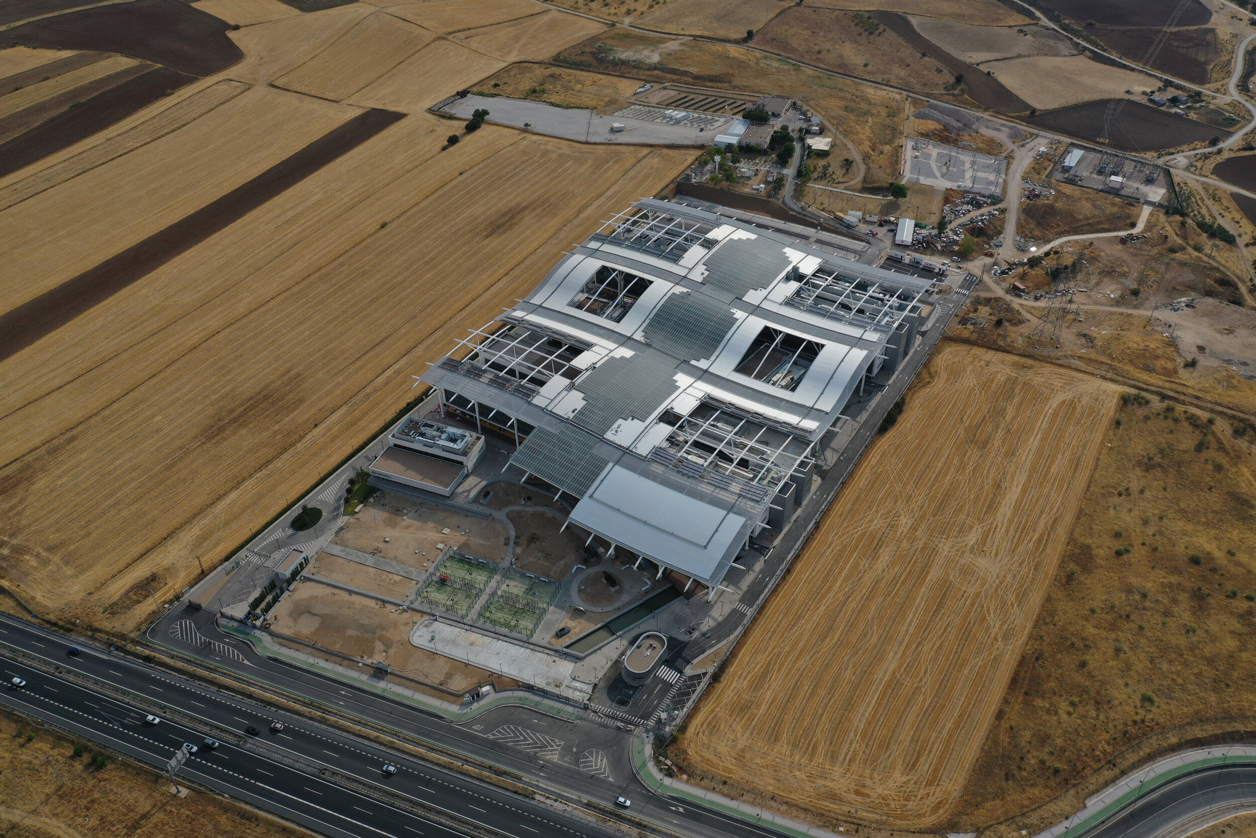
Campus Iberdrola’s new canopy, designed by Alonso, has held up against the burning sun of what could be the hottest summer in the recent history in Europe. The 35.000 sqm horizontal structure acts as a double skin cladding, providing sun control and shading over the 6 buildings  and  surrounding outdoor spaces below. The structure is composed of several different surface materials, providing shade, transparency and support for the renewable energy systems as PV and solar thermal panels. Its double wing shape - inverted on the windward side- promotes a constant air flow underneath, increasing wind chill factor.

Generative design of geometry

Generative design of geometry

On the summer that has been determined as hottest on record - according NOAA and AEMET- such  device can stablish the difference of being able to use outdoor spaces - besides the fact that it promotes lower  AC consumption inside the buildings and  increases energy savings. 

As we started to see more buildings coming up with a double skin/cladding system, Alonso considered that on a project with multiple buildings under the same program, a more convenient way was to use a horizontal cladding instead. Besides providing the same amount of sun control, as a typical double skin façade, it allows extra protection for outdoor spaces and reduces any heat island effect that might be produced by the outdoor paved surfaces. According to AEMET just in Madrid city - mostly due to the heat island effect-  the number of nights with temperatures above 20°C has increased from 10 to more than 20 just in the last 10 years.  

A deeper look at the canopy structure and its figures demonstrates high efficiency in terms of construction value, mostly thanks to the wind tunnel testing performed at the design stage to optimize structural design. Like that, canopy’s total weight - estimated at around 6.800 ton- is split at an equal 50% ratio between below and above the ground. If for example, we’d compare this figure to a ship design,  a 50% ballast ratio would result in a high performance monohull. 

Iberdrola’s canopy during wind tunnel testing

Iberdrola’s canopy during wind tunnel testing

Infrared pictures measuring temperature over the same surface material, demonstrate a difference over 24°C between below the canopy and outside its footprint - for same type of material. 

Thermal imaging of outdoor spaces and surfaces showing a substantial  reduction of surrounding temperature - FLIR images by ARUP

Thermal imaging of outdoor spaces and surfaces showing a substantial reduction of surrounding temperature - FLIR images by ARUP

It's encouraging to see one of the top companies in Europe to make it into the Eurostoxx 50 and invest in the cutting edge sustainable architecture.

Plaza space under the shade

Plaza space under the shade

Architecture in pandemics by Ignacio Alonso


Architecture in pandemics

May 03, 2020

by Ignacio Alonso


'People don't know how to imagine the future, and they tend to repeat the past when they try'  Eduardo Punset (1936-2019) IMF economist and science divulgator

In the recent history, pandemics and infectious diseases have certainly affected the humankind, mostly those living in urban environments. Architecture has almost always responded in a way, either resulting in code and regulation changes, new typologies, new types of urbanism, or even new forms of use. In this article we will go through some of the architectural responses during the recent past, and find out how they changed the forms of living,  from the  individual scale (housing unit) to the global scale (city) and introduce some of the current options to form a better future.

Historical vision: infectious diseases (1850 to 1915)

Diseases caused by infections hit hard most urban environments during the end of XIX and beginning of XX century, mainly as a consequence of the rapid increase of the urban population without an adequate improvement in  the healthy living conditions. In 1900 and just in the United States of America, these types of diseases represented the 3 primary causes of mortality (Pneumonia, Tuberculosis, and Gastrointestinal infections), putting life expectancy at 47 years (1).

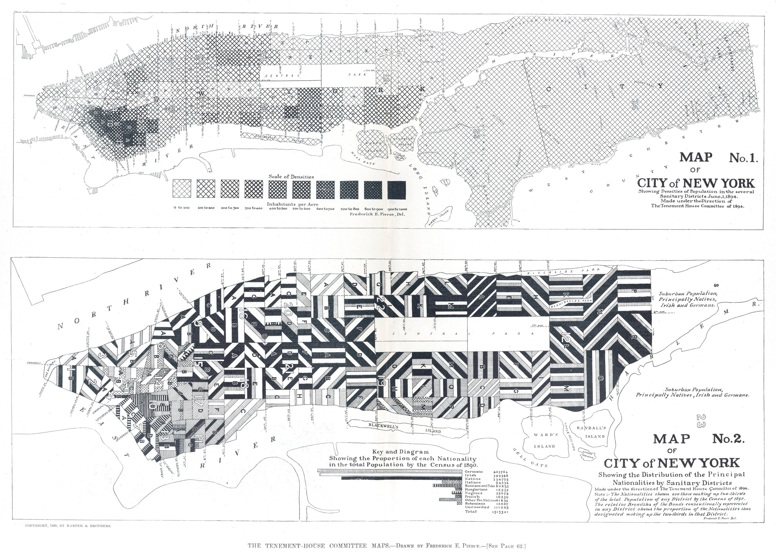
In the specific case of the City of New York, in 1894 some areas of the Lower East Side had population densities beyond 900 hab per acre (2) (225,000 hab per km2) - see Fig.1 ; currently Manhattan has an average of 25,800 hab per km2. Just understanding this data makes it easy to imagine some of the population's confinement at that time.

In 1903 the vast majority of the housing for poor people only had shared water closets installed in common hallways, without privacy, and some installed at the rear yards. Only in New York City there were about 82,000 constructions of this type (3) ,  and up to 79 families were forced to use a same bath tub (4).

One of the first voices to raise alarm about these conditions was Dr. Simon Baruch (1840-1921). He established his practice in New York City in 1881. Dr. Baruch became an advocate for the use of fresh water to avoid and cure infections. His book 'Principles of Hydrotherapy' (1898) is probably the best expression on that direction. Thanks to his studies and efforts he persuaded the Governor to make immediate changes: the Public Baths were born.

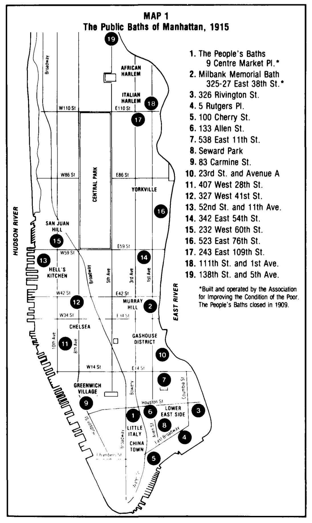
In 1895 the State of New York passed the law for erecting Public Baths in all urban settlements beyond 50,000 people. In 1897 a first Public Bath in Manhattan was open (9, Center Market Place). Only in New York City up to 18 public baths were erected - see Fig.2.

The rebirth of Public Baths can only be attributed to legislative's slow pace to implement individual bathing inside dwellings and its technical difficulty, and as an emergency solution to resolve immediately the problem at a city scale.

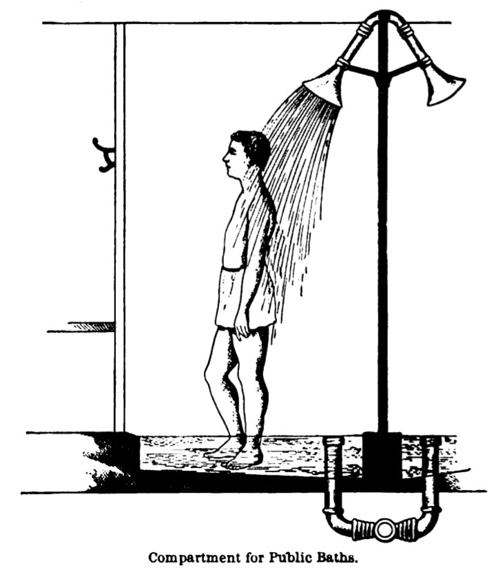
The construction of the Public Baths was founded with public resources and focused on  personal hygiene, unlike other similar constructions more focused on the lucrative side like the Turkish Baths. Their establishment will allow technological development on systems that shortly after will be key in disease control and prevention, like personal shower - see Fig.3.

As a consequence of the Public Baths establishment, a new culture of hygiene was born, which resulted after time in a demanding matter from the population. In 1901 a new tenement law was passed including mandatory bathrooms in residential dwellings. Thanks to the persistence of new technology development to reduce construction cost, in 1916 one piece amanel galvanized tub was invented. 

Already in 1934 and during the Great Depression, a survey in the City of New York only found 11% of dwellings without private bath tub or shower.

A bright future: flexible spaces

The greatest years in boom construction in the City of New York were between 1900-1930 (5). This period of construction represents today 63% of the city's total residential buildings, which means that the surviving buildings are in average 90 years old. The situation is pretty much the same in most of  historical European cities. 

Therefore seems logical to consider an average longevity rate for the planning of any new construction and/or rehab. It's almost impossible to predict what will happen in such a large span of time and how a building will be utilized during the entire period, but current technology and construction methods can easily help to set a up a strategy to facilitate any future change of use of any given new or rehab structure, so use changes can be accommodated in an easily manner.

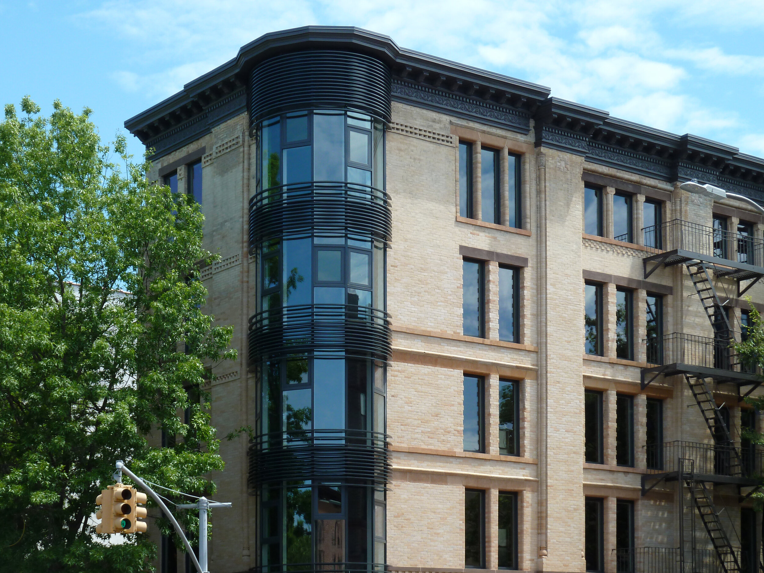
The 187 7th Avenue building (Park Slope, Brooklyn, erected 1920) was object of a full rehab in 2016 - see Fig.4. Located on a corner lot, its footprint occupies almost 100% of the space, resulting in a 25' x 90' rectangle. Each floor is occupied with a single apartment, with direct access via stairs and elevator.

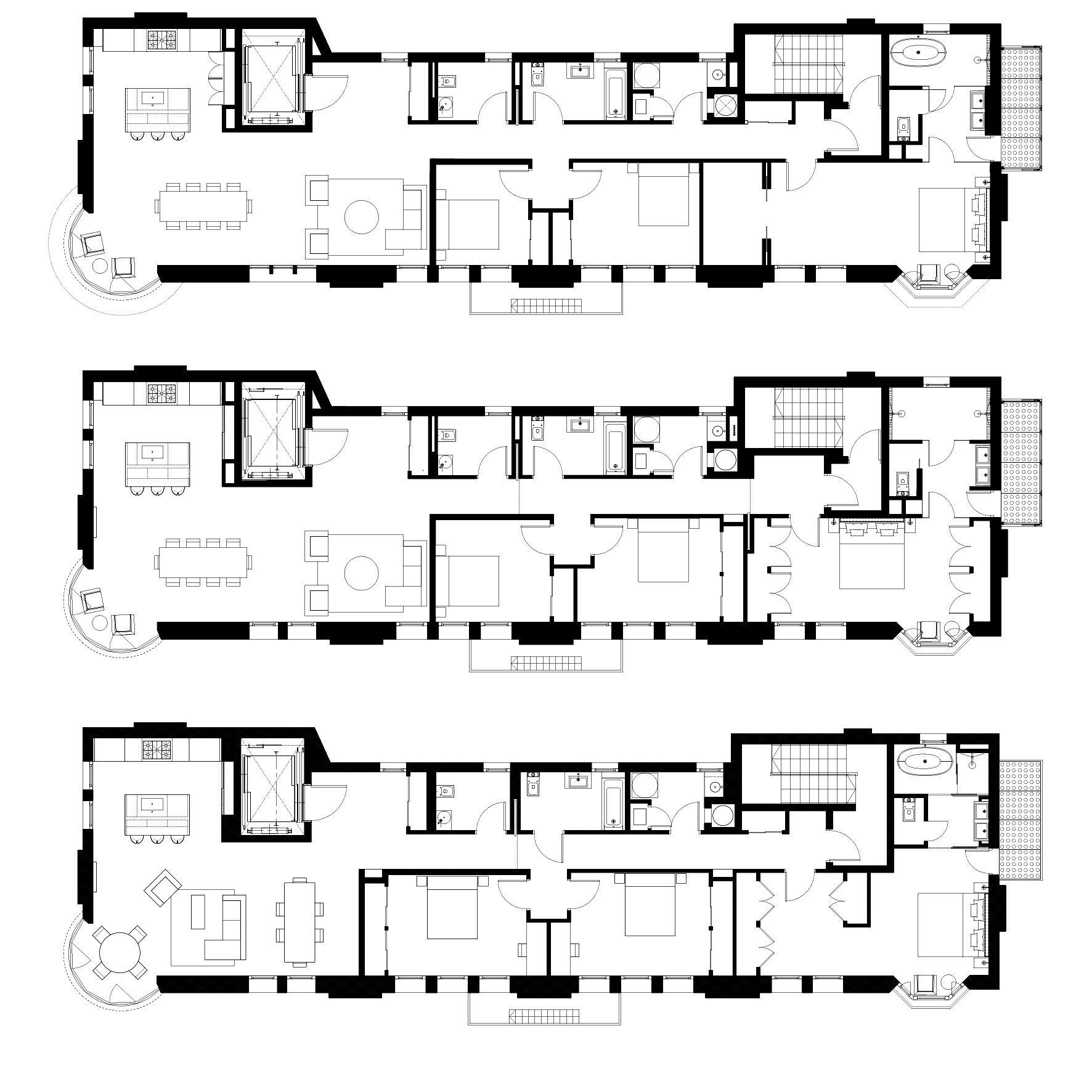
The goal of the design was to create a new residential type that allows interior layout changes through time and being easily adaptable to each owner personal requirements - see Fig.5.

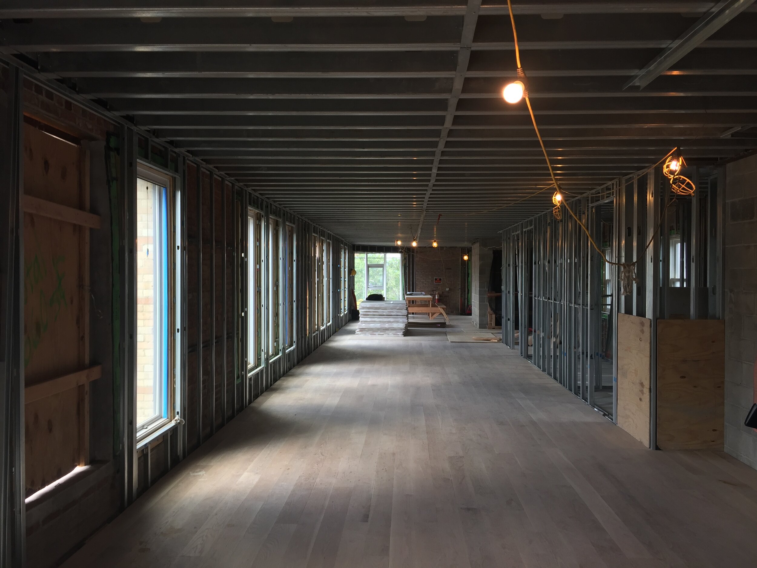
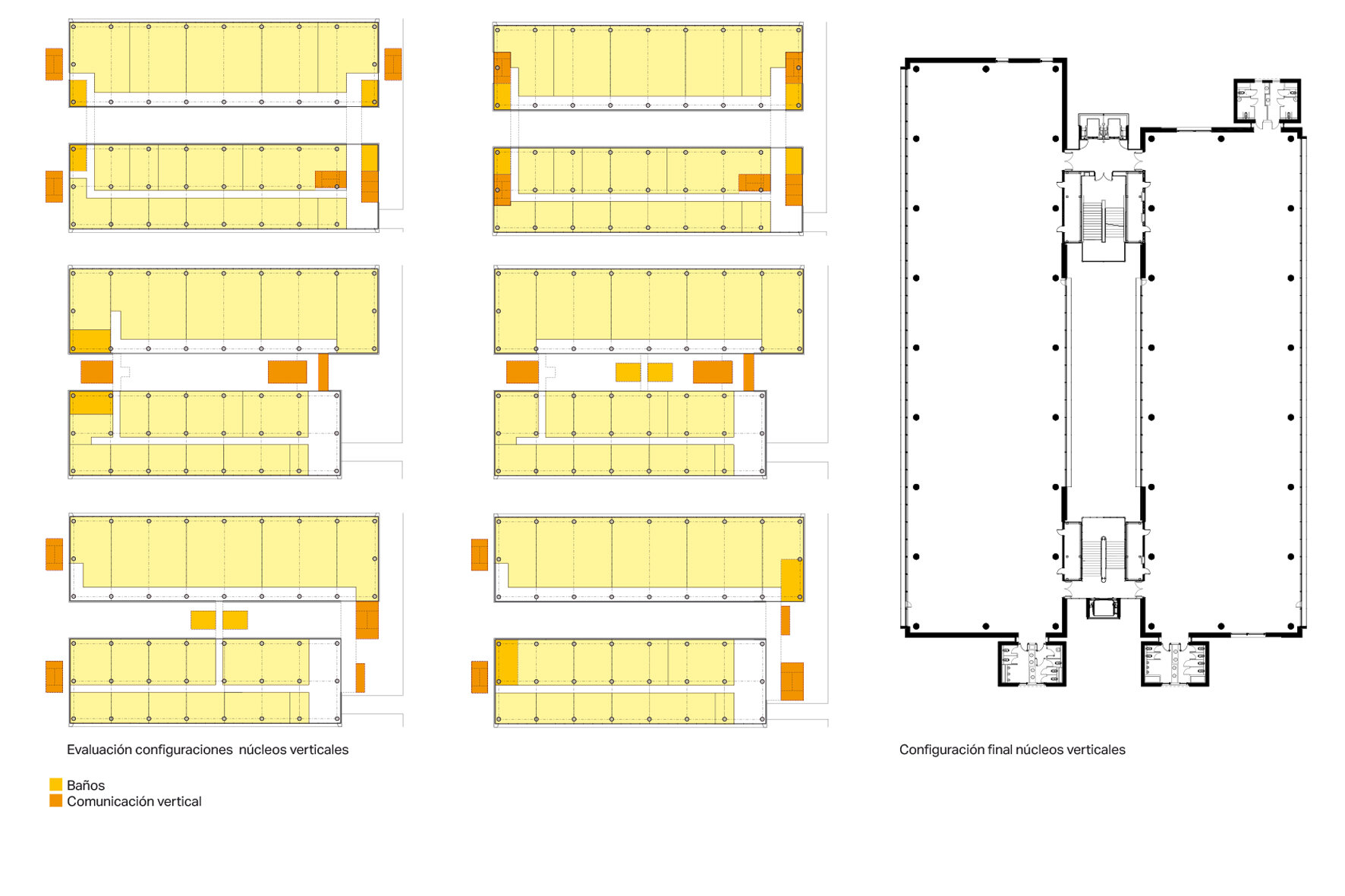
With this in mind, all wet areas (such as bathrooms, kitchen and wet room) and cores (stairs and elevator) are arranged in a single strip. This set up eases the rest of the interior space of any vertical penetration (such as risers, shafts, etc.) and allows complete freedom for the interior partitions layout. The finished floor (American oak) was installed continuously throughout making the interior walls floating above it, so when they get changed there are no traces of what was there before - see Fig.6. The heating system is a Hydronic radiant floor system installed in the same way, so heat is always equally distributed no matter which layout there is.

With this set up any changes on the layout can be accommodated in an easy manner using dry construction and avoiding a need of any other trade such as plumbing or electrical, and without affecting any service for the rest of the building.

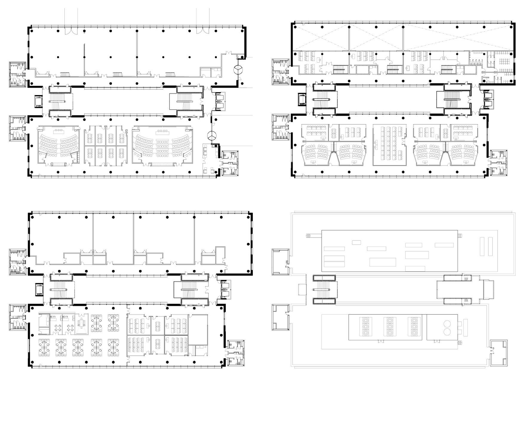
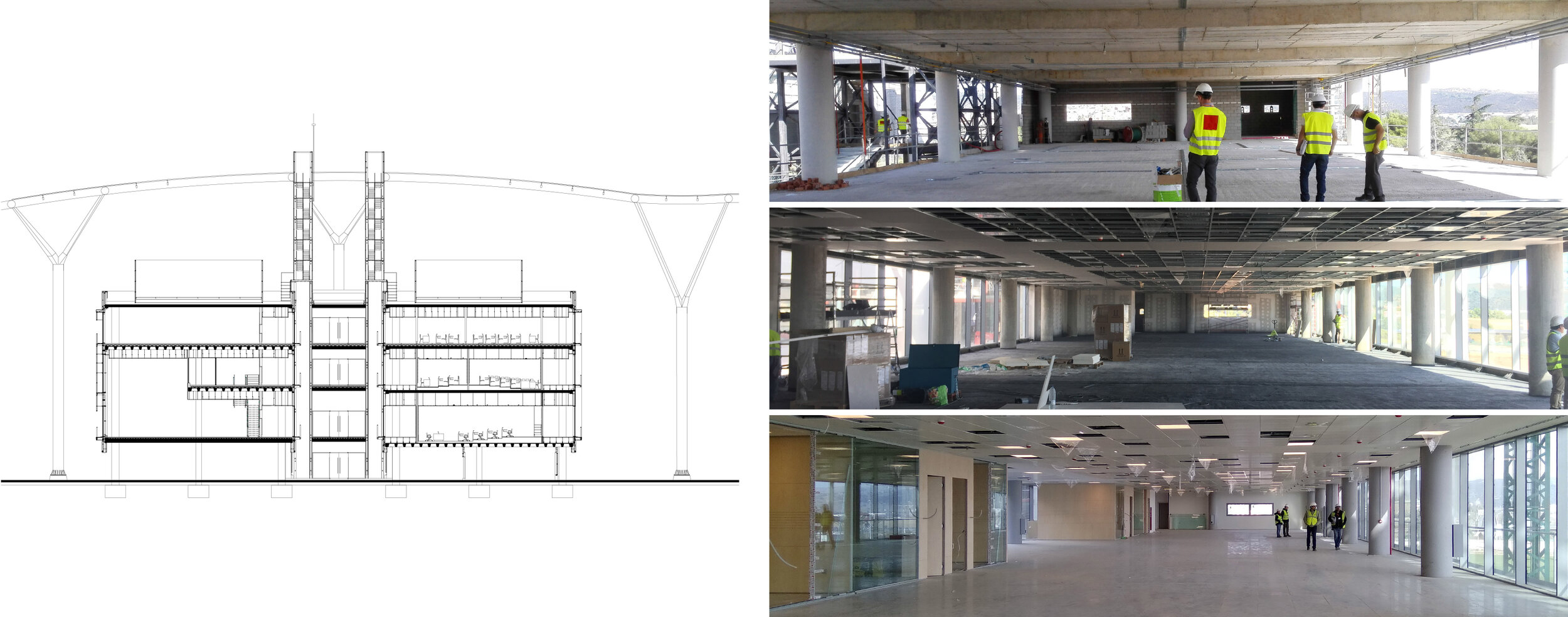
Not only residential housing can be subject to layout adjustments as a result of working remotely, kids leaving to college, reuniting grandparents at home or expanding storage area; educational uses are also subject of layout changes mainly due to continuous introduction of new technologies. Most probably it is educational uses that will require larger functional variation in time. Keeping the concerns of the future of education in mind, the Iberdrola's Corporate Campus was designed - see Fig.7.

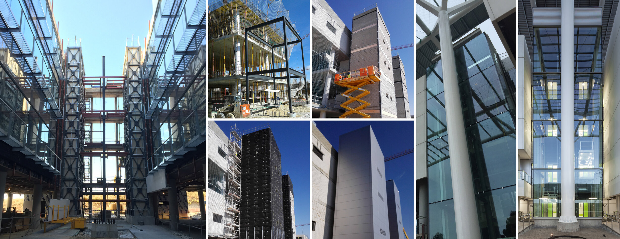
Iberdrola's Corporate Campus consists of seven ground-up buildings. All buildings have exterior cores (stairs and lifts) and exterior risers (mechanical, electrical and plumbing) - see Fig.8 and Fig.9; in four of these buildings the wet areas (bathrooms) are also exterior - see Fig.10. By the use of big spans - up to 16m-  the buildings can achieve up to 1,000 m2  'empty' floor plates without a single vertical penetration - see Fig.11. This strategy allows great modularity for the internal spaces, and a total flexibility in the interior layouts, so the spaces can be reconfigured after time without any restriction.

No crystal ball is available to predict what the future will hold, but there're available strategies that can facilitate facing any kind of future.  

Source:

(1) Carolina Demography, data source by Centers for Disease Control

(2) New York State Tenement House Committee 1894, source: Wikipedia

(3) Tenement House Problem, Macmillan & Co. Ltd 1903

(4) What became of New York's ubiquitous Public Bathhouses?, source: Curbed New York

(5) PLUTO built-year data, source: NYC Department of Buildings

AIRE Ancient Baths by Ignacio Alonso

AIRE Ancient Baths TriBeCa

AIRE Ancient Baths TriBeCa

Aire Ancient Baths - restoring the true meaning of 'Spa'

September 25, 2019

by Ignacio Alonso

If you had googled “spa NYC” prior to 2011, most probably you’d have gotten a few nail & hair salons close to you.

 These days, the search for ‘spa nyc’ results in the first four out of nine images displaying the design that Alonso Designs developed for Aire Ancient Baths. Narrowing the search to the word ‘baths’ instead, the first nine images out of twelve are related to his design for Aire Ancient Baths in Tribeca.

 What is a true meaning of the word “Spa”? If we look at Wikipedia, the term is referred to the town of Spa in Belgium, a village well known already during the roman times because of its healing spring waters. At the beginning of the XIX century, this term started to be commonly used to designate any health facility based on healing by water - Salute Per Aquam - at that time mostly related to ‘balneariums’ (health resorts). So there shouldn’t be any doubt the word’s root entails a water related origin.

When Alonso Designs completed the first design of Aire Ancient Baths in the US, the aim was to restore the true use of the term ‘spa’ in it’s pure meaning related to the use of water. The focus was not just to provide a relaxation space as any other ‘spa’, but also a place where water could become the center of gravity.

Therefore the design efforts were driven to maximize water features in harmony with the preservation and restoration of the beautiful landmark structure that supports Aire Ancient Baths. The result is a space with six different water bodies, each of them dedicated to a specific treatment. Alongside these water bodies stands a steam room as another way of exploring water. Inside a crystal clear structure, the steam room makes the invisible steam visible, and dissipates the boundaries of water states, from gas to liquid.

So it shouldn’t be a coincidence that those ‘spa nyc’ searches on internet are coming with more and more images related to Aire Ancient Baths. Nevertheless, New York City always had a long tradition of roman inspired bath houses. At the beginning of the XIX century, up to eighteen public baths were built by the municipality in Manhattan and Brooklyn. Some of them are still standing, representing some of the best examples of Neo-classic Architecture – such as the Asser Levy Recreation Center.

Alonso Designs is collaborating with Aire Ancient Baths New York providing unique expertise and advice on spa design. To find out more, please visit the wellness folder in our web site to discover other spa-related projects.